t’s the dawn of a new decade, and new logo trends are already in the spotlight. The up-and-coming logo design trends 2020 are a mashup of old and new. We’ll see a ton of throwbacks to different eras: the chrome and neon 80s juxtaposed against inky, black-and-white images that feel right out of the 30s. Right next to them, we’ve got logos tailor-made for today with 3D gradients and complex animations.
The logo design trends for 2020 will continue to build on everything designers have been exploring in the last few years, while also taking design in directions that are totally new, totally fresh, totally right for an all-new decade. Let’s take a look at the top logo design trends that are already defining 2020.
The top 8 logo design trends 2020 are:
- 3D gradients
- 80s throwback logo designs
- Raw & imperfect logos
- Logos with ultra thin lines
- Vintage 1930s cartoon logos
- Multi-layered & overlapping logos
- Complex animations with elaborate details
- Daring typography
1. 3D gradients
In 2020, you’ll see the popular gradient trend evolve and merge with the 3D trend—a perfect fit for our smartphone society.
Gradients are a great way to turn any group of colors into a dynamic spectrum of color that feels like it has life and energy. This year, designers will give rise to the newest evolution of gradients creating depth and 3D effects in logos. Especially tapered gradients—ones that come to a central point and actually emphasize the contrast between their colors—are poised to rock 2020 logo design trends.
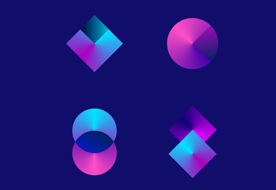
3D gradient logos can be tough in print, but they’re perfect for screens. That’s why they’re super popular with brands that don’t need to worry too much (or even at all) about how their logos look in print.
Expect to see designers explore the full potential of gradients this year, using them to create captivating 3D effects, shadows and depth like we’ve never seen before.
2. 80s throwback logo designs
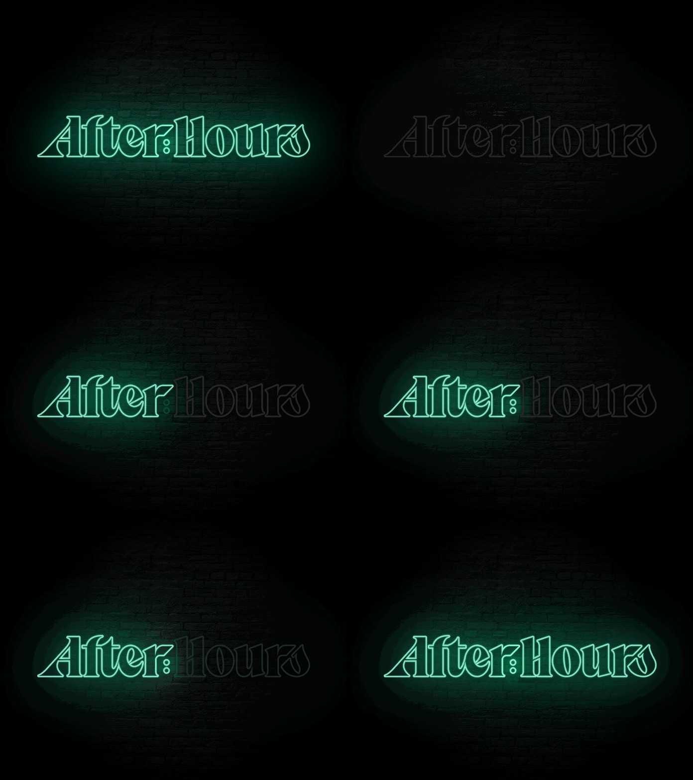
Enough time has finally passed for all things 80s to be cool again: video games, pop music, and the attitude that came with them. In 2020, expect to see a resurgence of 80s throwback logos with a lot of chrome, a lot of neon and a lot of pixels. Plus, we’ll get a lot of nods to the old-school tech that preceded the glowing pocket rectangles our eyes are glued to today.
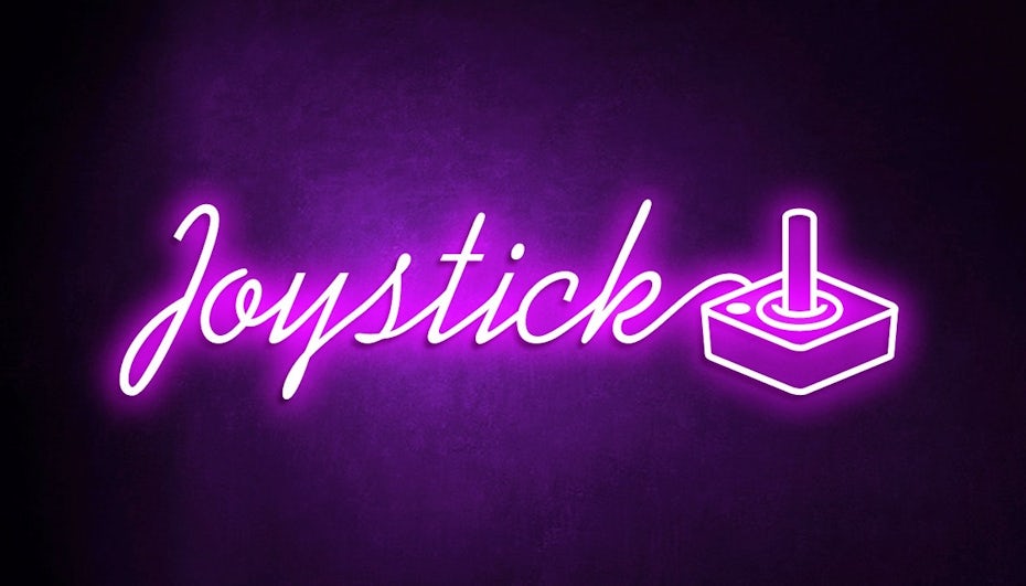
Some logos reference nostalgic 80s items, like the Joystick logo below. Others play with this trend by incorporating 80s typography and design trends.
The more bombastic, the better when it comes to 80s-inspired logos.
3. Raw & imperfect logos
Right next to digitally designed gradient and 3D logos, we’ve got logos that are proudly hand-drawn. These logos celebrate the “wabi sabi” that comes with drawing and writing. They reject the sleek, perfect look made possible with design programs and take us back into sketchbooks where there’s asymmetry, uneven lines and shading techniques like cross-hatching and contour shading.
Just like other 2020 logo trends, raw, imperfect logos have been on the rise for a while. This year, they’re getting grittier and more sketch-like and stamp-like as brands continue to embrace the homegrown, organic look.
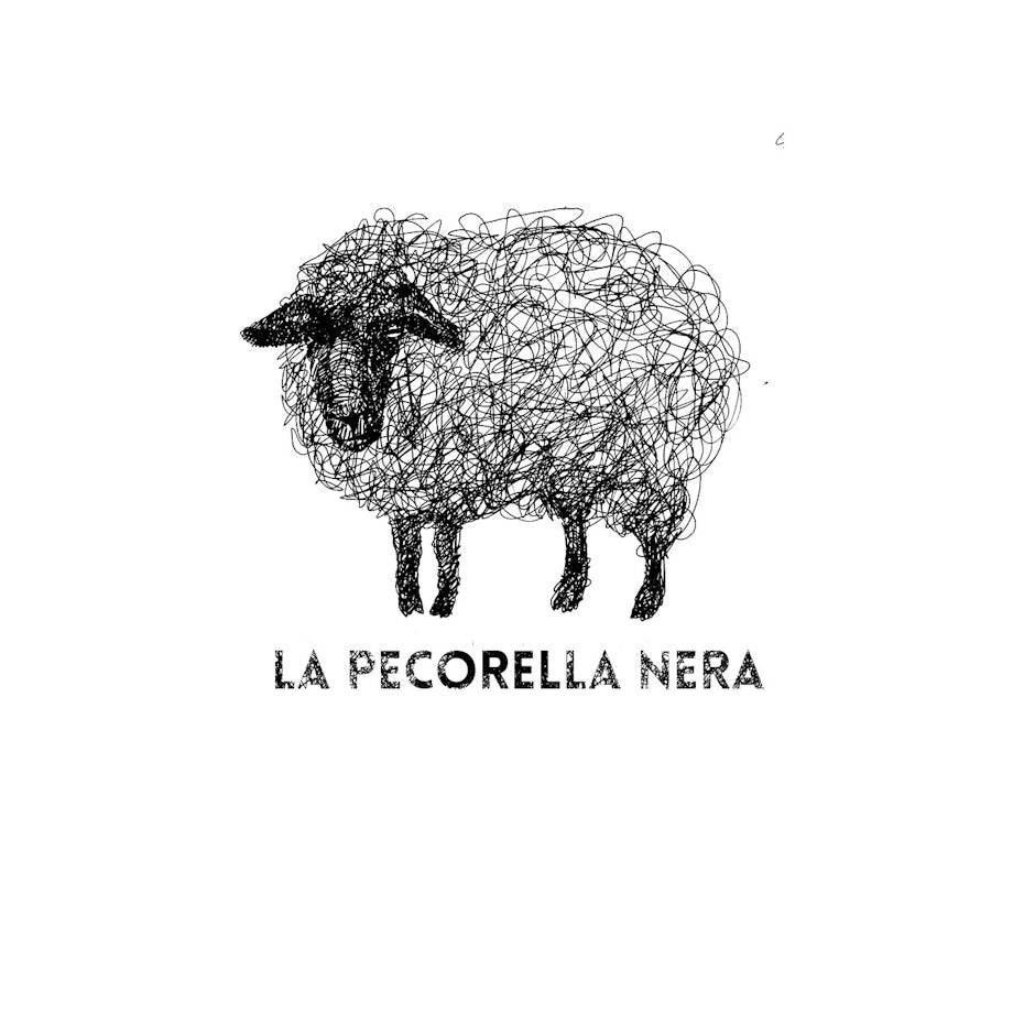
Creating a hand-drawn-style logo can make it possible to use and highlight textures that can’t easily be drawn using software.
A raw, rugged brand can express itself effectively with a hand-drawn, gritty logo.
With all the digital perfection out there people are craving the raw imperfections of hand-drawn logos. Brands can use the hand-drawn look to show off their authenticity and give their logos the personality their customers want to see.
Sometimes, the “scrawled in a sketchpad” look is the absolutely perfect look.
4. Logos with ultra thin lines
In 2020, digital media is leaving its mark on logo design like never before. We are seeing designers push the envelope with extremely delicate lines, creating effects that can only work in the digital sphere.
Due to their extreme level of detail these logos feel complex and ethereal—a completely new style in logo design, leaving classic logo requirements like simplicity and reproducibility behind. Now that brands can exist exclusively online, logos are no longer limited by print restrictions.

Logos with ultra thin lines are sleek, abstract, and difficult to pull off without computer assistance, which is probably why it’s popular in tech and industrial branding. This style seems to express the future of technology—something less and less physical the deeper we venture into “the cloud”—and speak to the mysterious possibilities awaiting us in the coming years.
5. Vintage 1930s cartoon logos
Like the 80s trends above, this is another nostalgic design trend, but with an entirely different style.
In our fast-moving world where everything is being digitalized, people are looking for the familiar comforts of printed vintage cartoons to keep them grounded. And the simple, expressive and adorable style of the 1930s hits the spot, appealing to designers and brands alike.

Illustrative logos communicate much more effectively to customers.
In 2020, expect to see more vintage-inspired, custom-illustrated cartoon logos that connect with viewers on a deeper emotional level.
6. Multi-layered & overlapping logos
In 2020, logos are going deeper than they’ve gone before, through layer after colorful layer. With this trend, designers are pushing past flat and semi-flat design. Shapes and colors will still be simple, but with more layers to play with, designers are creating more complex logos that use highlights, shadows and overlapping colors to communicate even more about their brands.
Take a look at the Oshen logo by Arthean, for example. The logo consists of multiple small circles set off-center within a larger circle. Layering and shading turns these circles into a wave. The three-dimensional effect of overlapping elements and shadows creates a tactile experience, like you could almost reach out and feel the individual layers.
Layers don’t always have to have color. Designers also use shading and semi-transparent layers to create subtle effects.
Layers and overlapping elements will be drawing eyes deep into logo designs in 2020.
7. Complex animations with elaborate details
Animated logos are nothing new, but today’s designers are making them more complex, more interesting and overall, more useful for the brands that rely on them. Some of the ways we’re seeing this happen with 2020 logo design trends is the blending of 2D and 3D animation in logos and complex logos with multiple moving parts.
Traditionally, animated logos are simple and to the point, but with new technologies at their disposal designers are pushing the envelope, playing with details and making their animations more elaborate and artistic. These complex logo animations aim to take the viewer on a journey and tell a story.
With lots of details to look at, the viewer looks at these logos longer than they’d look at a more simple logo animation and can potentially find something new they like about it every time they see it again.
The move toward more complex animated logos comes from a similar place as the tapered gradient logos trend: when you’re designing for screens, there’s a whole lot more you can do than when you’re designing for print. One of those things is detailed animation.
You’ll also see a ton of animated logos that have different versions for all the places they’re used, and that trend isn’t going to stop anytime soon. In fact, it’s just getting more popular in 2020 because as brands have more places to put their logos online and off, the more challenges they face of making a logo work on multiple platforms.
8. Daring typography
In 2020, we’re going to see a lot of logos that elevate text from just the words that support the image to the focal point themselves. Expect to see logos with funky, daring fonts that have personalities as vivid as the brands they represent.

Goopanic described 2020’s personality-driven typography as “weird,” but you could also call it funky, crazy or daring. Think of it as typography that has a mind of its own. Instead of picking from a list of the same old standard fonts according to a client’s brand identity, logo designers are creating typefaces that are extraordinarily different from any fonts we’ve seen before.
There are lots of ways to play with typography, like distressing, inverting or mirroring. Even scattering the letters so the words don’t read linearly. Or using a font that looks like something else, like scales on a fish’s belly or pawprints in the snow. There isn’t one “right” way to do a funky font logo; the only thing to get right is to make sure it’s legible.
Ready for the top logo design trends of 2020?
New decade, new design trends. These logo trends are the ones that are kicking off a brand new era of design. Only time will tell where they all fall. And we can’t wait to see how they’ll all be used, subverted and reimagined in 2020 and beyond!
Article Provided By: 99designs
![]()
If you would like to discuss Your Logo Design Needs with Mojoe.net or your website’s analytics, custom logo designs, social media, website, web application, need custom programming, or IT consultant, please do not hesitate to call us at 864-859-9848 or you can email us at dwerne@mojoe.net.


Recent Comments