")
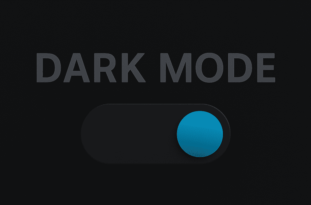
The Rise of Dark Mode: Benefits and Implementation Strategies
In recent years, dark mode has transitioned from a novelty feature to a staple in digital design. Its surge in popularity isn’t just a trend—dark mode benefits users in numerous ways, from reducing eye strain to enhancing device battery life. For businesses and developers, implementing dark mode effectively can improve user experience and engagement.
Let’s explore the rise of dark mode, its advantages, and strategies for smart implementation.
Why Dark Mode is Gaining Popularity
Dark mode isn’t just an aesthetic choice anymore. Platforms like Apple, Google, and Facebook have all embraced it because of user demand and tangible dark mode benefits, such as:
-
Reduced eye strain, especially in low-light environments.
-
Battery savings on OLED and AMOLED screens.
-
Modern, sleek visual appeal that aligns with current design trends.
-
Improved focus by minimizing screen glare and highlighting content.
These advantages make dark mode a must-have for apps, websites, and software products.
Key Dark Mode Benefits for Users
1. Less Eye Fatigue
Light text on a dark background reduces exposure to blue light and glare, which helps users who work long hours on screens.
2. Better Battery Efficiency
On devices with OLED screens, dark pixels use less power—translating into longer battery life for mobile users.
3. Improved Accessibility
For users with visual impairments or light sensitivity, dark mode provides a more comfortable reading experience.
How to Implement Dark Mode Effectively
Adding a dark theme isn’t just flipping colors—it requires thoughtful design choices to maintain readability and usability.
Use True Grays Over Pure Black – Avoid pure black (#000000) backgrounds. Instead, use dark grays like #121212 to reduce contrast and improve readability.
Maintain Brand Consistency – Adapt your color palette carefully to ensure your branding remains recognizable in both light and dark modes.
Test for Accessibility – Ensure text contrast meets WCAG standards and that all UI components remain visible and intuitive in dark mode.
Provide an Easy Toggle – Allow users to switch between light and dark modes easily. Remember: user control is key to a positive experience.
Tools and Resources for Dark Mode Design
-
Figma and Sketch for creating light/dark variants.
-
CSS Media Query:
prefers-color-schemefor automatic theme switching. -
Contrast Checkers: To validate color contrast and accessibility.
Final Thoughts
The dark mode benefits are clear, and users increasingly expect this feature as standard. By thoughtfully implementing it, designers and developers can improve usability, enhance user satisfaction, and stay ahead in the evolving digital landscape.
Recent Comments