Top UX/UI trends for 2023
1. Device synchronization. This trend is particularly important because it indirectly defines every other trend for UX/UI. People want to use applications not because they are good but because they are available. There are lots of products to choose from. Cheaper, more expensive, bare-bones, or fully equipped to the roof with functionalities. The choice isn’t a problem. The problem is whether a user can sync up settings and content between a personal computer, laptop, phone, tablet, smartwatch, and any other digital device connected to the web.
It’s not only for businessmen, ordinary people need it too. The ability to surf up the web and customize the experience with an option to flawlessly have everything on any device is what defines “usability” in 2023 and beyond.
2. Mobile-first design. A natural consequence of the previous point. People use their mobile devices in various ways and for many reasons. Booking flights, talking to friends, attending online calls, online window shopping, actual shopping, and many other things. All is handled on the go, with convenience in mind.
That’s why UX design and UI design should be made for virtually everything. Applications should adopt a design language that is clear for users but easy to scale. Adopted on every single device, it will turn visitors into paying customers.
3. Design for wearables. First of all, it’s a thing. Second of all, it becomes increasingly important, since many people use their bands or watches and other gadgets in multiple ways. For private, professional, and social use, which forces designers to innovate on a whole new level.
Minimizing interruptions is a top priority. Users want to know what’s going on but designing a feed to be helpful, not intrusive is a challenge. In 2023, graphic artists will focus on delivering the content in a more natural and friendly way. Another strong trend is a “mirror design”, which forces teams to architect applications in a very similar way for multiple devices. If something occurs on a smartphone, it should be reflected (or even doable) on a tablet or a smartwatch. And vice versa.
Prioritizing contextual design is also very important. If you want to record a run, a smartwatch should let you play music or a podcast while doing it. One or two taps away. The final trend is has increased focus on light-weight interactions. The ability to quickly respond to a message or a text without a full-sized keyboard (through voice recognition or a simple emoji) will go even further. Quick in-app and cross-app interactions, with previously mentioned mirror design, will elevate a number of applications to a new level. Especially in the light of another important UX/UI trend to watch.
4. Cross-application design. This trend is especially visible in FinTech, where many companies reach partners in order to strengthen and extend their market offer. A company that cooperates with another application, should have a dedicated subpage for it and easily maneuverable options on mobile devices.
If a customer wants to pay their electric bill through an app and is considering taking a mortgage through a third-party partner, the payment application should display a clear set of rules and options for it. No external software, no complicated messaging. And if that’s a thing, a clear offer that is understandable for the user. And easy to compare; users love to compare offers.
5. ID authentication. There are many options to confirm identity. Fingerprint scan, retina scan, and old fashion passwords. Among others. Each of them presents a unique set of challenges. What and how to display a login dialogue when someone is looking over the user’s shoulder? What to say when the Face ID doesn’t recognize the face over a face mask? What about a passport scan? Do we display a symbolic cover or the user’s real ID and photograph?
Most of these issues were already addressed in recent years but some questions still loom. What about privacy? How can we differentiate from other apps on the market and show that our system is truly secure? How can all of this information contribute to and fit into the application’s overall visual identity and branding? How to say something old in a new and innovative way? This is probably one of the most demanding to figure, latest UX/UI trends to follow.
6. The scroll is dead, enter scrollytelling. Things just got serious. Not that previous trends should be taken lightly. It’s just that transmitting information to other people demands an interesting message and the format that the audience will like and accept long-term. Scrolling is boring, as the new inside joke says. Nobody wants to scroll down for relevant information, hoping that boring sections of the page will finally turn into something useful.
Scrollytelling is a recipe for that. It’s basically a set of tricks that energize users and make them see a page in a new light. For example, you scroll and see a bunch of animations popping up next to the text in the center. Or an additional graphic, explaining what you just read. Scrollytelling is about providing additional context, providing additional explainers, and enriching content with dynamic elements that lure users through movement, color, and contextualization.
Unfortunately, no one can be told what Matrix… erm… what storytelling is. Static pictures don’t do it justice, so head to this link to know more.
7. Making data sexy for users. Users love their apps. Apps gather data. Sometimes data is displayed back to users. Users love their apps but are usually lost within the context of large data pools. Displayed poorly – to hide or underestimate something. Or because a person responsible for UX/UI doesn’t have a grasp of this particular area.
You can surely see the pattern. Displaying data and simplifying the messaging that comes out of it will be one of the top priorities in 2023. Exactly – let’s repeat that because it’s important. Users don’t want just to see data in an understandable way. They want to really understand it. That means simplification; removing from the screen everything that is distracting.
It also means, for example, overly big numbers and areas that users can tap into. Yes, with a physical tap. Why? Because interaction is also very important. Since not everything can and should be displayed on one screen, people need to have an option for additional information. That can come through a tap and deep dive into a category or spending, for example. But to tap it and know more, users need to have breathing room. Squeezing everything together to display more information is not a good idea.
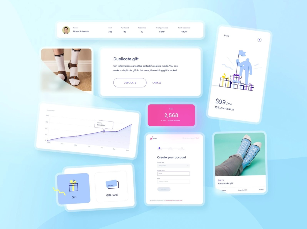
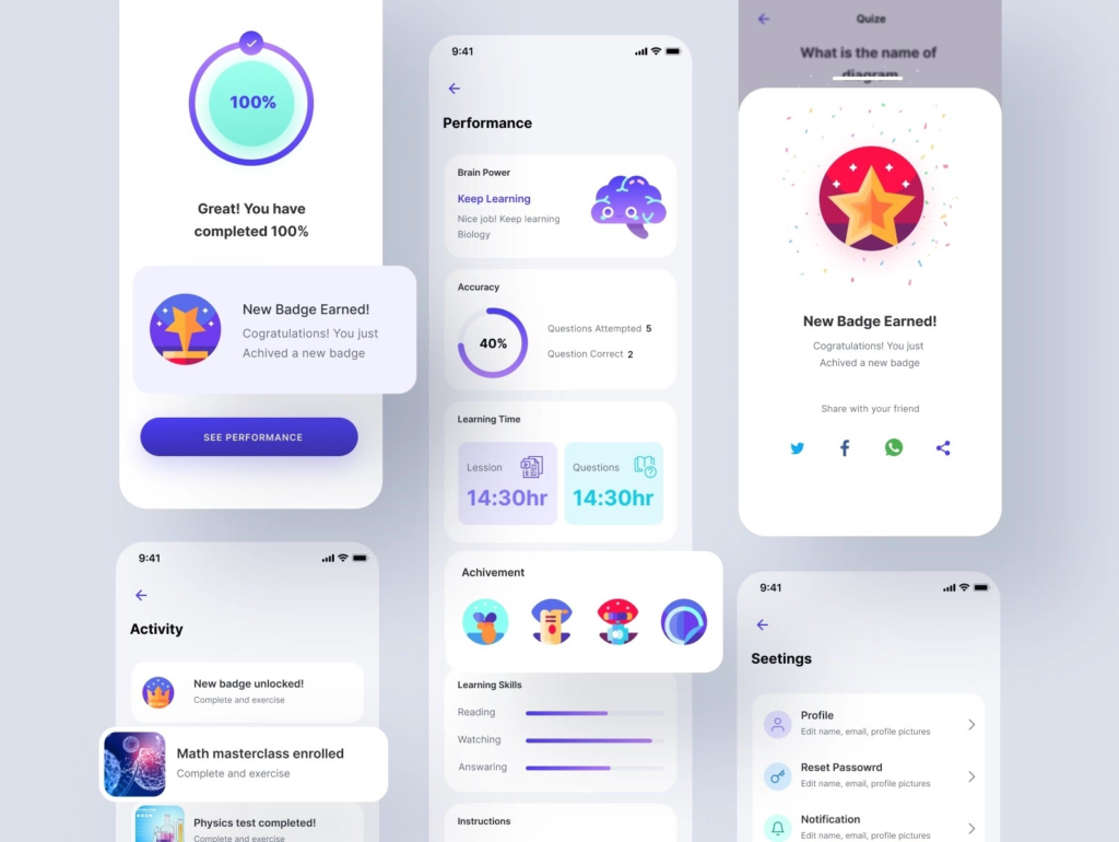
8. The emotional UX/UI design will get even more traction. It doesn’t matter if you’re using a smartwatch, tablet, smartphone, or a potato. You display your content on something. You’re probably using it to view your monthly spending, track physical activity progress, etc. The app gives you feedback. No, not information, feedback. Coupled with an icon (band, watch, phone) or a more complicated image (even a splash-screen, sometimes), it gives you a context.
You have been able to save up this month. You just broke a record on a one-mile run. You have gathered more business contacts than you did in the previous quarter. Congratulations to you! And designers, that perfects the art of giving you well-deserved praise. Designing these messages that are usually a mix of a microcopy and a graphic brings users closer to their goals. It also generates customer loyalty. The role of emotional design will only grow in the upcoming months.


9. Metaverse. Meta design. Meta… erm… everything? Let’s face it – we have problems with defining what Zuckerberg’s Meta really is about. Playing chess in a park with a friend physically present miles away will not happen today, but it will happen sometimes in the future. At least that’s the promise for zombie-like state users, who are glued to screens 24/7.
Fortunately, we don’t need extreme examples to imagine a meta-future. All we need is a good, old VR set and Facebook’s VR remote work app. That’s a possibility for the future of work and cooperation, where agile teams from across the world don’t talk to each other via Skype or Zoom but rather in a fully interactive, virtual reality (VR) environment. It will need a design for that.
Not tomorrow, not right away. But it’s reasonable to imagine whole teams of UX/UI designers storming VR platforms the minute Zuckerberg talked about the transformation to Meta. Virtual user experience and user interface will need specialists. Sooner than later and 2023 will be the first big step towards an even more virtual future.
10. Accessibility will be the norm. It’s fairly easy to predict the needs of a healthy person and implement them into an app. What about a disabled person? It goes way beyond a dark theme.
Wide-range implementation of contrasting colors, the ability to increase text size, elimination of graphic content to serve the previous need, providing captions to videos or even descriptions to images are all steps in the right direction. But it should go even further. Paying attention to visual hierarchy or allowing users to resize entire screens go a long way to make sure everyone can use the product.
11. MVP will be replaced with MLP. Minimum viable product (MVP) is no longer viable for few reasons. Now enters minimum loveable product (MLP), which is basically MVP but without compromises and bugs.
MLP is about focusing on users and their needs. It’s about minimalism and the sense of completion. This version of MVP is still not complete but polished. In the case of MVP, users can’t experience all the features and still have negative experience with those that are implemented. MLP is not a representation of a finished product, yet users can be satisfied with what they get.
We expect this trend to continue down the road. Not only in the FinTech industry but overall, in software development.
Article Provided By: Codeandpepper
 If you would like to discuss Your Website’s Search Engine Optimization with Mojoe.net or your website’s analytics, custom logo designs, graphic design, social media, website, web application, need custom programming, or IT consultant, please do not hesitate to call us at 864-859-9848 or you can email us at dwerne@mojoe.net.

Recent Comments