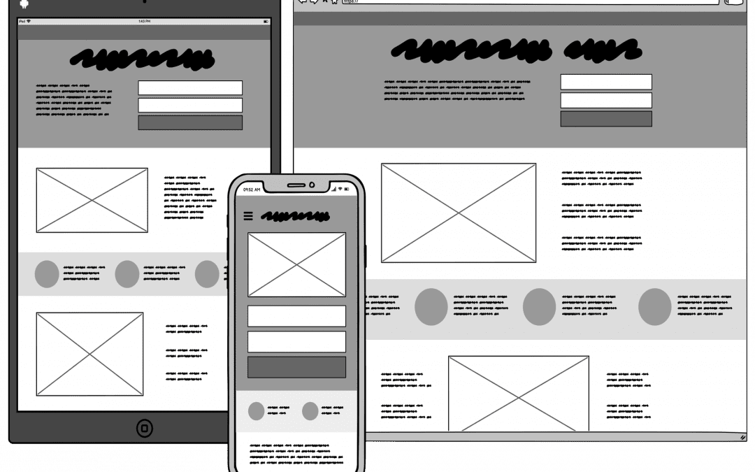
Wireframing
Wireframing is a two-dimensional illustration of a page’s interface that specifically focuses on space allocation and prioritization of content, functionalities available, and intended behaviors. For these reasons, wireframes typically do not include any styling, color, or graphics. Wireframes also help establish relationships between a website’s various templates.
The Value of Wireframes
Wireframes serve multiple purposes by helping to:
- Connect the site’s information architecture to its visual design by showing paths between pages
- Clarify consistent ways for displaying particular types of information on the user interface
- Determine intended functionality in the interface
- Prioritize content through the determination of how much space to allocate to a given item and where that item is located
Creating Wireframes
It’s important to keep in mind that wireframes are guides to where the major navigation and content elements of your site are going to appear on the page. Since the goal of the illustrations is not to depict visual design, keep it simple.
- Do not use colors. If you would typically use color to distinguish items, instead rely on various gray tones to communicate the differences.
- Do not use images. Images distract from the task at hand. To indicate where you intend to place an image and its size, you can instead use a rectangular box sized to dimension with an “x” through it.
- Use only one generic font. Typography should not be a part of the wireframing discussion. Within the wireframes, however, you may still resize the font to indicate various headers and changes in the hierarchy of the text information on the page.
Since wireframes are two-dimensional, it’s important to remember that they don’t do well with showing interactive features of the interface like drop-downs, hover states, accordions that implement show-hide functionality, or auto-rotating carousels.
Important Elements Illustrated in Wireframes
Although wireframes differ from site to site, the following elements often are included as standard elements on wireframes:
- Logo
- Search field
- Breadcrumb
- Headers, including page title as the H1 and subheads H2-Hx
- Navigation systems, including global navigation and local navigation
- Body content
- Share buttons
- Contact information
- Footer
Types of Wireframes
Wireframes can vary both in their production, from paper sketches to computer-drawn images and in the amount of detail that they convey. Low and high-fidelity are terms used to identify the level of wireframe production or functionality.
- Low-fidelity wireframes help facilitate project team communication and are relatively quick to develop. They tend to be more abstract because they often use simple images to block off space and implement mock content, or Latin (lorem ipsum) text as filler for content and labels.
- High-fidelity wireframes are better for documentation because of their increased level of detail. These wireframes often include information about each particular item on the page, including dimensions, behavior, and/ or actions related to any interactive element.
References
- Jesse James Garrett’s The Elements of User Experience: User-Centered Design for the Web and Beyond (2nd Edition)
- Presenting Information Architecture
 , Web Style Guide 3rd Edition
Article Provided By Usability.gov
 If you would like to discuss Your Website’s Search Engine Optimization with Mojoe.net or your website’s analytics, custom logo designs, graphic design, social media, website, web application, need custom programming, or IT consultant, please do not hesitate to call us at 864-859-9848 or you can email us at dwerne@mojoe.net.


Recent Comments