")
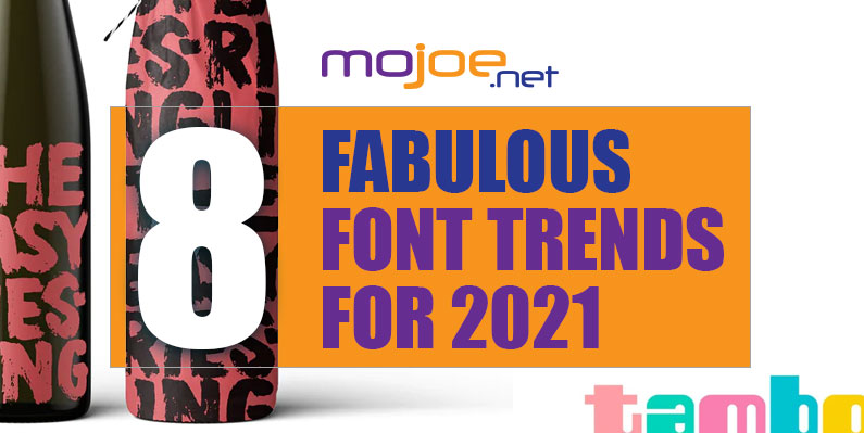
The top 8 font trends for 2021 are:
- Alternating baselines
- Disco revival
- Dynamic lettering
- Extra sharp angles
- Standout letters
- Solid shadows
- Typewriter font evolved
- Rounded block fonts
1. Alternating baselines —
All caps text is useful for more than just shouting matches on the internet. In crucial contexts such as titles and brand names, it is often necessary. It makes words feel more important and grownup, but all caps lettering also comes with a price. From a design perspective, capitalized words tend to form a boxy shape, which can read as less visually interesting than the height variation provided by lowercase forms. But by taking advantage of uneven sizing, font designers are writing outside the box in 2021. This trend alternates the cap height and baselines of capitalized letters in order to create variety. Designers can also intensify this by changing the thickness between letters and even tilting their axes. The result is letterforms that are full of surprises while maintaining the uniform emphasis of capitalization.2. Disco revival —
If we see the past through rose colored lenses, we see the 70s through rainbow colored ones. The 70s in our collective memory feels like a decade-long party. We imagine the shimmer of disco balls, the strut of platform shoes, and the time-honored dad dance: The Lawnmower. Likewise, 70s style typefaces remain popular for all the festive vibes they convey. The resurgence of disco fonts comes in the form of multicolored type, thick curves and psychedelic effects. These are typefaces which demand a double take, and they will be the font of choice for groovy themes in 2021.3. Dynamic lettering —
Writers and typographers around the world have always known that words have a life of their own, but this is becoming a tangible reality through 2021’s trend of dynamic lettering. Dynamic letters create the illusion of movement using fluid shapes, textured shading, and action lines—like a mid-motion snapshot. This trend is an analogue compliment to last year’s kinetic type, reminding us technology was never a necessity for moving art. Dynamic lettering can not only transition well into real animation, it will trick you into thinking it already has. The tradeoff is that dynamic type is more difficult to read, but designers whose projects involve illustrative hand-lettering and large, singular words might easily find themselves swept along with the movement of this trend.4. Extra sharp angles —
Ralph Waldo Emerson famously said, “Words are alive. Cut them and they bleed,” but nobody expected words to cut back. Many fonts in 2021, however, are being designed to accentuate their sharpest edges, proving the old adage that the pen is mightier than the sword. Aside from being notable for the easy attention their extreme angles invite, these are fonts with a literal edge. They feel rebellious and pair well with dark colors and devilish concepts. If your brand is bound for the dark side, you’ll want to make sure you bring something sharp.5. Standout letters —
For better or worse, fonts are designed to fade to the background. While this may come across as dull, it’s what allows letters to read well, putting the meaning of the words ahead of the designer’s ego. Typically, fonts achieve this through a predictably uniform style, but in 2021, many designers are creating wordmarks with individual letters that stand out from the rest. Take for instance goopanic’s curly ‘z’ in the Razor Babes logo or the sneaky lowercase ‘I’ in BlueBerriez’s Fleur Skin logo. These letters manage to break the mold without breaking the reader’s attention. The approach can also be more pronounced for a more emphatic logo as in the ‘I’s abduction in RAHAJOE’s Alien. The end result is a visual focal point for the viewer and a renewed creative license for the designer.6. Solid shadows —
For a thing you can’t touch, shadows have great power. Even the simplest shadow will launch a design into the third dimension, and this year the font designs of 2021 are lifting off with the aid of extra weighty shadows. These shadows are solid enough to embed their fonts in stone while their angular projection gives letters the appearance of flight. Bright colors contribute to the feeling of lightness and freedom. All in all, this is a style that comes across as undeniably positive, resembling more of a ray of light than a backdrop of darkness. Though it can be a useful accent to a logo design, we expect to see more solid, bright shadows on creative hand-lettering projects where optimism is the message.7. Typewriter font reimagined —
For a font grounded in defunct technology, there is something special about the enduring appeal of typewriter font (Courier, for all the typeface nerds out there). Like the mistakes on typewritten manuscripts, you can’t get rid of this font so easily, and in 2021, designers are reinventing it for the digital age. Although this typeface is made for machines, it is far less perfect than those made for computers. These imperfections are ideal for grungy textures, smears and blotches of ink, and faded, timeworn letters. It was originally intended for body copy, but we are finding it featured more often on book covers, posters and even logos—where its thin, unassuming letters enhance a minimalist aesthetic or it is blown up to emphasize its texture. Despite the grittiness of this font, it paradoxically possesses a quaint, vintage appeal designers seem to be finding solace in amidst our increasingly digitized world.8. Rounded block fonts —
In prose, big blocks of text tend to feel daunting—more like a chore to read than a pleasure. But ever up for a challenge, the font designers of 2021 are pursuing an aggressively blocky look for wordmarks and titles. Specifically, we are seeing an increase in thick sans serif fonts that look as immovable as stone but contain rounded corners for a softened, retro look—reminiscent of classic curvilinear fonts like ITC Bauhaus. As a staple of digital design, rounded corners also convey an immediately modern, hi-tech aesthetic. And when paired with thick letters, the result is fonts that make their subjects feel bold and approachable at the same time.Ready for the biggest font trends 2021? —
With the new year nearly upon us, the font trends of 2021 are already spelling out a new destiny for the young decade. Fortunately for us, that destiny appears to be a positive one, as these trends emphasize bright colors, the thrill of disco, and extra special letter variations. With these bright and moving trends, we expect to see fonts take center stage in 2021. Article Provided By: 99 Designs
If you would like to discuss Your Logo with Mojoe.net or your website’s analytics, custom logo designs, social media, website, web application, need custom programming, or IT consultant, please do not hesitate to call us at 864-859-9848 or you can email us at dwerne@mojoe.net.
Recent Comments