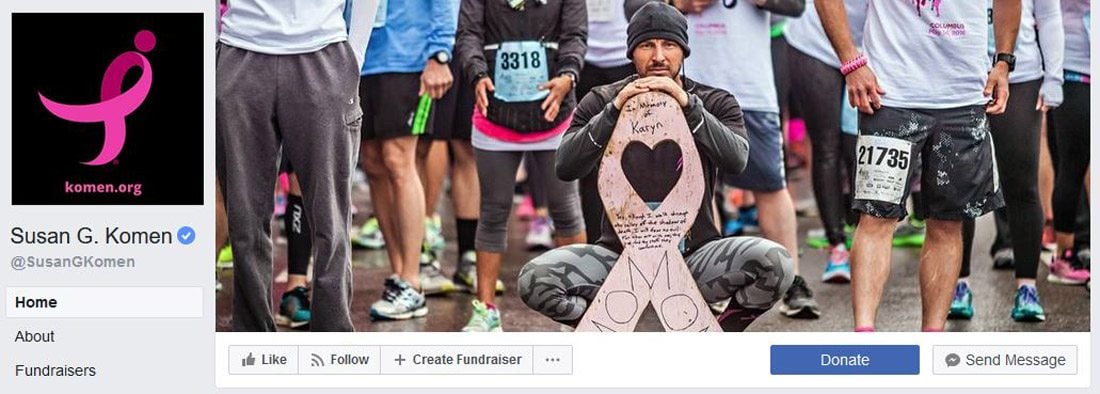
Almost every business and individual – from personal pages to freelance business pages – uses Facebook. It’s likely an integral part of your marketing strategy. It might even be your main professional website.
So it is important that you make the most of this platform to ensure that your social media profile is polished and professional. A sloppy image, bad crop, or text that scales improperly can give the wrong first impression. Here are 10 tips for creating a perfect Facebook cover image that people will want to click.
1. Know the Specs
The first piece of the Facebook cover photo puzzle is size. There’s nothing like sizing an image wrong and creating a major Facebook fail. (And if you haven’t updated that cover photo in a while, this is a good reminder to check the specs because they do change periodically.)
As of March 2018 the specs are:
- 851 pixels wide by 315 pixels high for cover photos
- Save with a file size of less than 100KB
- Make sure to check the high quality box when you create an album in Facebook so that images maintain resolution and quality
- Upload as a JPG with an sRGB color profile
2. Select the Right Image
Facebook is a highly visual medium, the right image can make or break engagement and how users feel about your brand or page. You need a great image, so you should:
- Pick a high-quality, high-resolution photo or illustration.
- Look for something that’s easy to “read” or understand even if it is small on the screen.
- Pick an image that represents your brand and shows a person or product in action.
- Try to make an emotional connect with imagery.
- Look for a photo that fits well in the space allowed. Crop the photo in image editing software to make sure it looks great at 851 pixels wide by 315 pixels high and that vital parts of the image aren’t absent.
3. Add a CTA
While it’s not part of the Facebook cover photo design per se, think about what users will see when they go to your profile. Pair the cover photo and a related call to action to help generate leads, calls or website clicks. (A great photo can help spur engagement.)
The CTA button is directly below the photo to the right. Make sure to include something for users to do. Here’s how to add or change the information in that button; any page admin, editor, moderator or advertiser can do it.
4. Use Your Branding
Facebook cover photos should be consistent with your overall branding. Use the same style of imagery, colors and marks that you would in all other communications.
All of the pieces should have a consistent look and feel so that when your cover photo pops up – whether as a change in users feeds or from a visit to your Facebook page – there’s no doubt that the image belongs.
Think about branding in relationship to how profile and cover photos work together as well. One your Facebook page. They appear side by side in square (profile photo) and rectangular (cover photo) frames. In the feed, the profile photo is in a round container and the cover photo maintains its rectangular shape.
5. Try a Video
A great Facebook cover image doesn’t have to be a photo. You can upload video clips as well. (Just make sure to honor the specs.)
Add a video cover image in the same way as a photo, keeping the following in mind:
- The video has to be 820 pixels wide by 312 pixels high, although Facebook actually recommends a size of 820 by 462.
- The video has to be 20 to 90 seconds long.
- Pick a thumbnail option and publish.
6. Don’t Forget Mobile Cropping
Now here’s the catch about that cover image, it crops on mobile devices. While the cover photo displays at 820 pixels by 312 pixels on desktop screens (almost all of what you uploaded), the mobile image is a little more square and automatically crops some off the bottom and top of the image.
While you can’t upload a separate image for mobile users right now, we do know how much of that image will display: 640 pixels wide by 360 pixels tall. The resizer uses the full width of the image and takes roughly the same amount from the top and bottom of the image for the mobile Facebook cover photo.
Select and crop your image accordingly.
7. Make It Shareable
A great photo on social media is made to be shared! Think about images and elements that will make users want to share your cover photo in the same way as any other Facebook post.
Look for an image that contains plenty of emotion or action that’s relevant to your audience. Include a hashtag or small text block to inspire action. Opt for colors that stand out in feeds – bright options can work great, as well as brand colors to establish a visual connection.
8. Keep It Simple
Don’t overthink the Facebook cover photo design. Most people will probably see it small – think on a phone in the middle of a feed of other content – and trying to do too much with a single image can fall flat.
Find a great photo. Crop it to the proper specifications. Post it. Done.
9. Keep Text to a Minimum
The trickiest element to deal with when creating a Facebook cover photo design is text. Think about the two available crops – desktop and mobile. Think about the size it will appear to users.
Unless you can stick to something short and easy to understand – such as a logo or hashtag – you might want to avoid text altogether. Don’t clutter a great image with words just for the sake of having them there. Any text elements should be added with purpose and usability in mind.
10. Still Stuck? Start with a Builder or Template
Still not sure about cropping and aligning and getting everything in order for that cover photo? There are a handful of Facebook cover templates and tools that can make it easy. (All three of these options are also free, although you will need to sign up for an account.)
The nice thing about a Facebook cover photo builder or template is that the correct size and shapes are all preset for you. You don’t have to worry with cropping or image editing if that’s not your strength. Each of these tools helps you place your photo in a frame that’s the right shape and size and export for easy upload to Facebook.
Conclusion
Remember, each time you create and upload a new Facebook cover image, your followers get a notification in their feed. Make changes and time them with purpose. Include a comment or link to encourage engagement when you make the change.
Consider changing the cover photo seasonally or each time you offer a new product or service. This simple refresh can keep your profile looking fresh and creates an easy bit of content to share. Good luck!
Article Provided By: design shack
![]()
If you would like to discuss Your Facebook Cover Image with Mojoe.net or your website’s analytics, custom logo designs, social media, website, web application, need custom programming, or IT consultant, please do not hesitate to call us at 864-859-9848 or you can email us at dwerne@mojoe.net.


Recent Comments