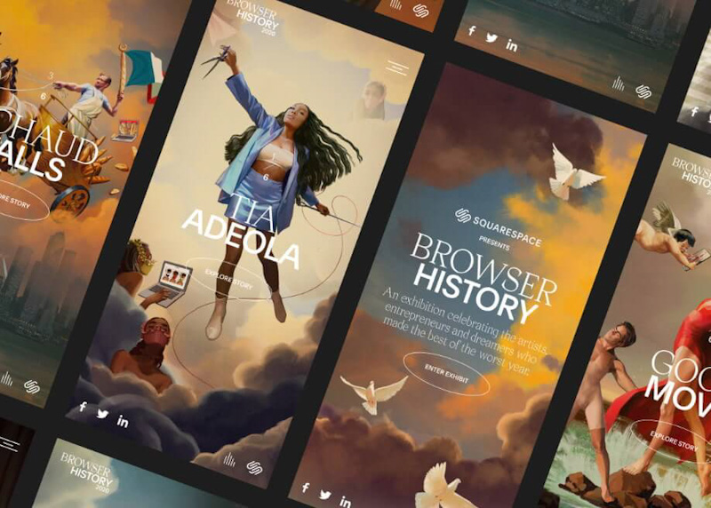
At Squarespace, we wanted to celebrate these people who did some pretty incredible things and managed to launch businesses against all odds with a new annual series called “Browser History,” highlighting some inspiring customers who used our platform to make their dreams a reality. To capture their inspiring stories, we partnered up with artist and illustrator Ignasi Monreal, who reimagined these resilient business owners and creators as renaissance heroes but with a modern twist.
The online exhibition
The main part of the Browser History campaign is the online exhibition that functions as an immersive museum for the incredible portraits that Ignasi created. The site is part of a wider campaign that also includes animated films and social assets. For each portrait, we really wanted the customers and their businesses to be front and center, portrayed like the great renaissance heroes, the likes of Napoleon Returning from Elba.
To bring this narrative to life digitally, we wanted to invite users to virtually fly through each portrait and dive deeper into each of the paintings and the stories of our customers. There are also plenty of subtle notes to 2020, like the UFOs buzzing the New York City skyline behind Richaud or Tia Adeola’s high fashion face masks.
Designing an immersive experience
The central navigation of the Browser History feature on the site is the Z-axis infinite scroll that flies users through the experience and all six artworks, each with its own mood and visual atmosphere with nods to our customers’ craft or business. When entering the exhibition, we wanted to build up excitement around the experience, make sure the transitions were smooth, and that the site performance wasn’t compromised on any device. The team agreed early on that the experience had to work flawlessly on both mobile and desktop, therefore we knew we needed a lot of testing and prototyping, ensuring we were building the site from mobile up.
Collaborating closely with Ignasi helped our design and development team make sure each portrait had enough detail and resolution to be scaled up for the zoom effect on the microsite. Once Ignasi finalized the portraits, our design team then took each portrait and sliced each part of them for our development team to animate and create the zoom effect, while simultaneously optimizing them all for performance. This meant that each small cloud, piece of fabric, etc., had multiple versions of them to be used for different breakpoints which, in the end, resulted in hundreds of assets.
After breaking up all the portraits into smaller pieces, our motion designer then started visualizing and animating all the transitions and interactions to help us streamline them all for the web. We used Lottie to export all the animations since it’s able to parse and export After Effects animations as JSON, and then render them natively on mobile and on the web.
The technology behind it all
We knew that the effect of flying through a continuous 3D space was going to be the real “wow factor” of this site, but it was also the biggest question mark for us, how exactly we were going to implement it? To tackle this, our design, motion and development team started to build prototypes using a series of web technologies we thought might help us get there. While the site is fully built on the Squarespace platform, we knew we’d have to use some additional libraries to implement the Z-axis zoom effect and all of the custom animations on the site, and eventually settled on using Pixi JS fairly early on for a fast and lightweight 2D WebGL renderer.
Another hurdle our developers faced was how to easily share the application state between the Pixi JS canvas and the rest of the applications’ HTML functionality. We also needed to find a way to seamlessly transition between the canvas experience back to the more traditional HTML site experience. Layering HTML elements on top of or behind the canvas element worked well for our needs, and we were able to share the global application state using React and React Pixi. Lastly, the detail pages and text animations really came together using Greensock, the web animation library that pairs well with Pixijs sprite animations, triggering certain animations on scroll using Greensocks ScrollTrigger.
Final thoughts
What made this process of creating Browser History smooth and seamless was the collaboration between our developers, designers, animators, and of course, Ignasi. We all shared the same vision and worked closely with the same goal in mind, and our designers were helpful in coming up with elegant solutions that the technology would support.
Partnering with Ignasi—who mainly works digitally-enabled us to work with incredibly layered illustration files, which really helped us bring the whole campaign to life through delightful interactions, playful transitions, and mouse-follow-effects, while trying to avoid making the site a total bandwidth killer. We all feel like we ended up in a place where everything feels joyful and smooth, while supportive of the overall site experience.
Article Provided By Awwwards
![]()
If you would like to discuss Your Logo with Mojoe.net or your website’s analytics, custom logo designs, social media, website, web application, need custom programming, or IT consultant, please do not hesitate to call us at 864-859-9848 or you can email us at dwerne@mojoe.net.


Recent Comments