The decision to follow a trend must depend on the needs of your users and your business. The decision should never be based solely on “it’s what the cool sites are doing”. Fads fade. A site built only on trends quickly becomes out of date.
With that in mind, let’s look at the “Hamburger Menu” design trend, that you might want to think twice about using.
Hiding Everything Under a Hamburger Menu
As mobile devices became commonplace, designers started simplifying navigation and hiding it under a hamburger menu. It’s a trend that’s also crept into the desktop version of websites.
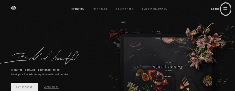
For example, the Squarespace site uses a navigational drawer across its site, regardless of device.
As you can see in the image above and below, the global navigation is hidden in the ubiquitous hamburger menu.
It’s understandable why this is appealing. Placing navigation under a hamburger menu makes a site cleaner, sleeker. And most people are familiar enough with the pattern. But this isn’t something that works for every site and can reduce discoverability.
The consequences can be harmful for e-commerce sites and news sites, where discoverability of topics and items is critical to the experience. As explained in Web Design Trends 2015 & 2016, forcing users to open the navigation menu in this situation may create unnecessary friction.
On Time’s website, you’ll find a variety of news topics hidden in the hamburger menu. However, Time combats the discoverability issue with a ticker on the side of recent news stories. There’s also a search feature prominently atop the ticker.
As pointed out in an excellent Nielsen Norman Group article, “Killing Off the Global Navigation: One Trend to Avoid,” hidden navigation could still alienate users.
As writers Jennifer Cardello and Kathryn Whitenton point out:
“Even if the global navigation is difficult to design and hard to maintain, most sites will still be better off showing top-level categories to users right away. It’s simply one of the most effective ways of helping users quickly understand what the site is about.”
As they point out, here’s a couple ways to tell if hiding global navigation is for you:
- Skyrocketing bounce rates on landing pages. Users won’t stick around if global navigation isn’t obvious, making it hard for them to browse the site.
- Where users are clicking. Are they actually clicking the hamburger menu? If not and combined with high bounce rate, then you know something is amiss. You can check the clicks with heatmapping tools from CrazyEgg and Usability Tools.
User behavior determines whether you should use a hidden navigation drawer on a full-desktop site. Don’t sacrifice usability and discoverability for pure aesthetics.
Article Provided By: AWWWARDS
 If you would like to discuss Your Logo with Mojoe.net or your website’s analytics, custom logo designs, social media, website, web application, need custom programming, or IT consultant, please do not hesitate to call us at 864-859-9848 or you can email us at dwerne@mojoe.net.


Recent Comments